What I learned from my first Usability Test
A guide to conducting your first usability test with confidence, including tips that guarantee your first usability research experience will be a whole lot smoother than mine 🥳

Why it’s important
How do we validate whether the product we’re spending so much effort building is something that people will want to use? The answer is simple — by asking the people who will be using it. Usability testing allows us to transform assumptions about users based on intuition and gut feelings into validated decisions backed by data from end-users.
Launching a product without research is equivalent to driving blindfolded.
Having a fresh pair of eyes look at our prototype before development not only gives valuable feedback but also helps catch mistakes we may have overlooked, saving time and money in the long run.
Want to read this story later? Save it in Journal.
When I worked at Instamojo, I conducted a usability test for the new MojoCard feature to ensure the setup and card management flows were intuitive and easy to use. Plus, to gather any insights for usability improvements in the feedback round.

Who to test
With time and cost constraints in mind, our users were internal employees who used the platform themselves and/or spoke regularly with the end-user. Although talking directly to end-users is ideal, a quick internal test within the company will still provide valuable insights.
Our sample size consisted of both technical people (engineering team) and non-technical people (marketing, sales, and business teams).
- Sample size: 12
- Type: In-person
- Method: Invision prototype
- Tools: Loop 11, SUS score
What tools to use
We designed a simple test consisting of 2 parts — the first part consisted of observing the users complete tasks on a click-through prototype by themselves and the second part was a feedback session where we measured the overall usability. The tasks were simple: asking a user to order a card, activate it, and then freeze it.
Part 1 — Loop 11
For part 1 of the test, we used Loop 11, a great tool that captures desktop recordings via the browser of the user’s face, voice, and screen. Here is a guide to creating a draft or script to follow in this step.
By recording both what our users are seeing on screen and what they are thinking aloud, we can gain more insight into their thought process at different points in the test.
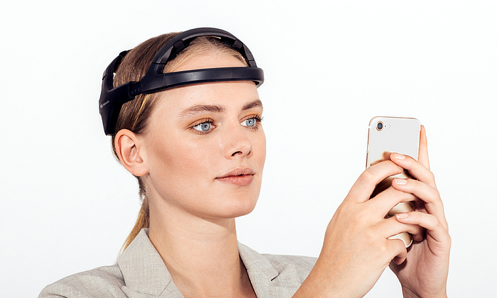
If you have the funds, I’d suggest using an EEG (ElectroEncephaloGraphy) headset. It can analyze brainwave data and map the user’s unarticulated and unsaid feelings, giving insights into behavioral and cognitive metrics. You can check out Affect Lab, they’re doing an awesome job with their brainwave mapping tool.

Part 2 — System Usability Scale
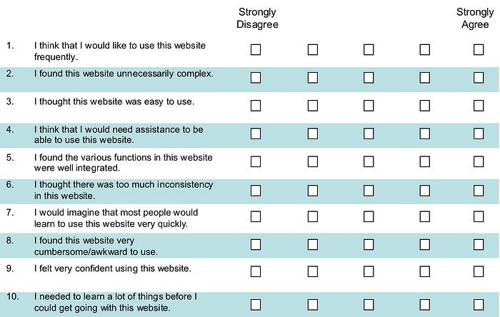
For the feedback round of the test, we made each user fill out a System Usability Scale (SUS) score sheet, which consists of 10 questions that the user can answer on a 5 point scale from “Strongly Disagree” to “Strongly Agree.”

The SUS score you calculate provides an at-a-glance snapshot of the usability of the product by considering these factors while making the calculation:
- Efficiency: How fast someone can use it
- Intuitiveness: How effortlessly someone can understand it
- Ease: How easy it is to use
- Satisfaction: How much a user subjectively likes or dislikes using it
You can read a detailed explanation of SUS here.

The SUS score results we collected for 2 usability tests for the Desktop and Android prototypes were 85% (A) and 82.95% (A) respectively, which is above the average score of 68. This confirmed the user experience was intuitive and easy-to-use.
SUS is quick, simple to conduct, and a cost-effective way to determine usability of a product.
What I wish I knew
The following tips will help improve the results of your test. For purpose of example, let’s say you have scheduled a user test with Rachel.
Tip 1: You don’t need a ton of tests
Research on the SUS score (Virzi, 1992 and Neilsen Landauer, 1993) indicates that 5 users are good enough to uncover 80% of the usability problems. We were lucky enough to conduct 12 tests, across multiple teams in the company.

Tip 2: Spend time briefing the user
Before starting the test, take time to brief Rachel about the product or feature and make sure she understands what the problem statement is. You can answer any questions she may have to set the context. What is the purpose of this feature? Why should it matter to her? That way she is confident when she starts the test and calmly goes through it with a 360 degree understanding of what she’s doing and why.
Since we don’t have brainwave mapping tech, don’t forget to remind Rachel to talk aloud when she goes through the prototype.
Tip 3: Assume the position of a test proctor
The goal is to imitate what would happen in a real-life situation, where Rachel is by herself using your product. The questions she asks are valuable data points and give insights into her thought process at a certain point in the flow. Just like any standardized test, do not speak and give answers to Rachel’s questions once the test has begun (unless there is a technical issue with the test).
Tip 4: Don’t rush the user
By telling Rachel, “this will take only 10 minutes of your time,” before the session begins, we unintentionally bring her attention to getting to the last screen quickly and finishing the task. We want Rachel to have a thorough approach to taking the test and focus on each element in each screen. Only then will she give you valuable feedback and question design decisions by the end of the test.

Tip 5: Tell user how important and impactful their feedback is
Initially, you may feel you can’t get feedback that is valuable from everyone who takes the test. Maybe Rachel just skimmed over the screens and didn’t offer feedback at all. If you think about it, she is closest to the majority of our end-users — they just press continue, don’t want to make any decisions, and don’t have much to say unless there is a true wow factor.
You have to get into the mindset that everyone has the potential to give valuable feedback. Gently nudging Rachel to dig deeper and provide feedback is integral to creating a product for the masses. Ask her what can make the product better in her eyes. Tell Rachel the influence she has on changing the way a product is presented to the users. In this way, we can gently pull insights out of anyone and everyone taking the test.
Collect results and update the product
The final part is to fix the design based on the collected feedback to enhance the user experience. It’s best to create multiple solutions to the same problem and work with your Product Managers and Developers to determine the feasibility of each of them. Be open to new ideas they may have, and together you can make small tweaks to enhance the experience for the end-user.

There’s no reason to feel intimidated by usability testing. It is an integral part of creating a world-class product. It’s as simple as having a conversation with a friend.
Don’t forget to give your 👏 !
📝 Save this story in Journal.
